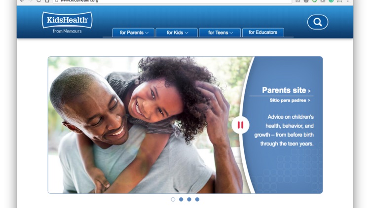

1. Starting with the main menu its very easy to use and has multiple ways of navigating through the website.
2. It covers its highest demographics in America by having a way to switch from english to spanish.
3. In terms of coding their main site, it seems to have very little errors, and the ones they have are very insignificant. Going to their alternative site is another story however.
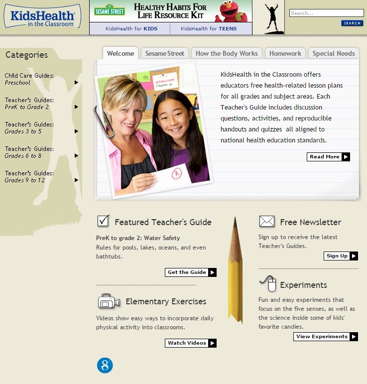
4. The Educator site seems a lot more dated, and has more errors.
5. Issues with Educator site includes: No page region or aria landmark, To small of text, Language missing, Imagmes missing alternative text, missing form labels, etc..
1. I would recommend to update the alternative website so it catches up with the main stie.
2. The second website is a lot harder to navigate, I would like it to be formatted the same as the first site.